Friday Anniversary Perspectives Opened Up Close: A Hidden Church Unveiled
Look UP inside St. Stephen’s: There’s a startling breach in our warm stonelike surfaces produced by Tiffany beginning in 1917. On one of the ceiling ribs to the south, a contributor to that effect (painted canvas) hangs loose, unveiling a section of Frank Furness’ 1878 stencils beneath.
That peek is all we have; the rest was hidden, removed, or destroyed by later repairs. Period descriptions tell us that Furness thus added another layer of messages to those of the architecture, windows, and sculpture.
He placed stenciled images everywhere, even deep in the choir loft. The journal The Churchman (October 1878; philadelphiastudies.org) describes vast fields of Christian emblems, some forceful and others muted, that changed according to the function of the zone.
Using that anonymous account, I offer here an imaginary journey through Furness’ lost interior at St. Stephen’s—which our critic does not attribute to him or his artists.
Imagine St. Stephen’s chancel paved with encaustic tiles bearing symbols of the Crucifixion. Then shift to the walls of the nave, where we see a “dado [defined section of the wall above the floor]” with “flamboyant [ornamented]” crosses. Around the windows we see a panel of spread palm leaves and dates, for our reporter symbols of victory and immortal life. Above the gallery we find images of fig leaves and fruit, symbols, claims our writer, of the Fall and divine knowledge. The sides of the ceiling ribs contain images of crosses.
The most elaborately stenciled space is Furness’ new baptistery south of the west door, correlating our symbolic entrance into the church with our physical entry. Centered on Steinhäuser’s font, we see “frescoes” of two soaring water-oriented “oasis” trees, palms, that frame symbols on the walls, the vesica piscis (two intersecting circles symbolizing Jesus), fish, doves, and scallop shells. Oh, for a photo of that site....
Color plays a huge role in the scheme. Color bands organizing the symbols shift from intense at the ground (maroon and gold) to lighter on the upper walls and ceiling but with strongly contrasting sections in the gallery. There, the organ draws the eye with new emblems in bright tints even from afar.
The effect, claims our 1878 guide, is truly magnificent without being “overwrought,” “wholly dignified” and “worthy of the place.”
To help our imagination, here’s a photograph, taken as Tiffany’s scheme was gradually introduced, that, even in sepia, suggests the richness of the north wall near the chancel. We see how bold the ceiling rib stencils appear within the whole, as encompassing bands of quatrefoils [four leaves], symbols of the four Gospels or the Cross.
Someday we may find out if Furness intended an integrated story. For now, from what we know, it’s surely a communicative and forceful interior. Yet it speaks with the architecture. Furness’ stenciled vigorous quatrefoils suddenly echo Strickland’s pierced detail (including quatrefoils!) on the ceiling ribs.
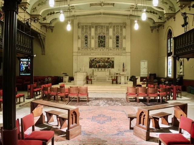
Interior of St. Stephen’s, 2018
In 1909, following advice from the eminent Philadelphia church architect Theophilus P. Chandler Jr., the church reportedly restored Furness’ interior. Yet eight years later (1917), Tiffany began his radical redecoration, replacing Furness’ strong, complex, and informative world with a muted eclectic alternative that accented rather than incorporated the interior’s strong details, from the gallery/organ loft to the colored windows and mosaic mural.
I wish we could hear discussions of the change....
The different schemes, revealed by the detached cloth on the ceiling rib, nonetheless make me appreciate how versatile Strickland’s design is. May we all look more closely at each feature today and see where it takes us.
— Suzanne Glover Lindsay, St. Stephen’s historian and curator


